The strongest link to our brand.
The logo continues the concept of the sun—a graphic element that has appeared regularly in graphic representations of Western Reserve University, Case Institute of Technology and Case Western Reserve. This time, however, it’s stylized to evoke the concept of the sun rising above Earth as seen from space.
This representation of light exemplifies the combined knowledge and strengths of Case Western Reserve: the liberal arts, humanities, medicine and sciences associated with Western Reserve University, and the engineering and technology associated with Case Institute of Technology.
The logo is the strongest link to our university brand. That is why it is important to use only approved logos in all communications. Whenever an unapproved logo is used or an approved logo is changed or altered in any way, it dilutes our brand.
University logos are trademarked and cannot be altered or incorporated into the design of other logos by any individual or entity that is part of or outside the university. Any individual or entity within the university with questions about appropriate usage of the university's logo or other aspect of its brand should contact University Marketing and Communications at marcominfo@case.edu. In addition, any outside organization or company wishing to use our logo on promotional or advertising materials must receive approval.
Proper logo usage
The Case Western Reserve University logo comes in five configurations: two-line, four-line, four-line stacked, four-line centered and as an acronym.
Because of its strong association with the university, the approved logo should appear on the cover of all marketing communications. The default placement for the logo should be at the bottom of the communications piece, signifying it as the anchor or signature component of your message.
NOTE: All versions of the CWRU logo should be displayed prominently and clearly. It is important to display the logo with sufficient clear space around it. Users also must adhere to the recommended color combinations in order to maintain brand consistency and integrity.
Each logo configuration has been set with customized letterforms and letter spacing and should not be created by retyping. Use the official vector artwork.
Unacceptable Uses
To maintain the equity and value of the brand identity, never alter any of the CWRU logos.
- Do not alter or crop
- Do not use the logo within body text
- Do not add a drop shadow
- Do not rearrange or reposition
- Do not rotate
- Do not distort
- Do not redraw
- Maintain legibility
- Do not create unapproved lockups
- Do not fill with image
Two-Line Logo
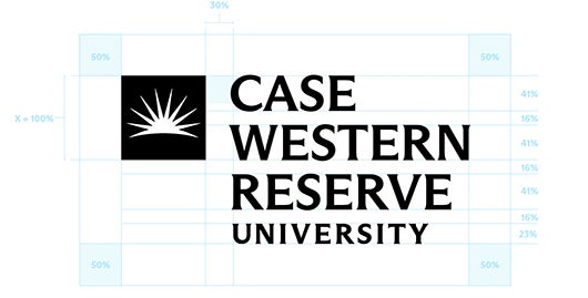
The two-line, horizontal logo should be used as the primary configuration for Case Western Reserve University.
The clear space is determined by 50% of the height of the square, indicated by ‘x.’
The minimum reproduction size of the two-line logo is 2 inches wide in print and 255 x 25 px for digital use.
Four-Line Logo
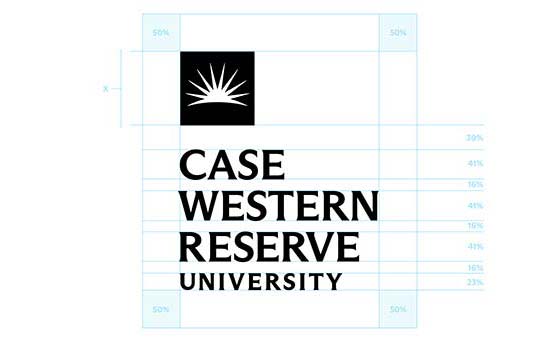
The four-line logo is an alternate way of displaying the name. Use this version for square, horizontal and vertical formats where legible.
The clear space is determined by 50% of the height of the square, indicated by ‘x.’
The minimum reproduction size of the four-line logo is 1 inch wide in print and 90 x 44 px for digital use.
Stacked Four-Line Logo
Use the stacked four-line logo configuration for narrow applications.
The clear space is determined by 50% of the height of the square, indicated by ‘x.’
The minimum reproduction size of the stacked logo is 1 inch wide in print and 75 x 90 px for digital use.
Centered Four-Line Logo
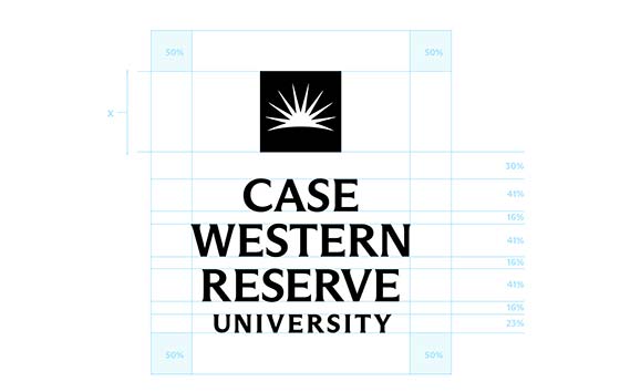
The centered four-line stacked logo is allowed when space is limited and neither the four-line nor two-line options can be used.
The clear space is determined by 50% of the height of the square, indicated by ‘x.’
The minimum reproduction size of the centered stacked logo is 0.75 inches wide in print and 75 x 90 px for digital use.
Acronym Logo
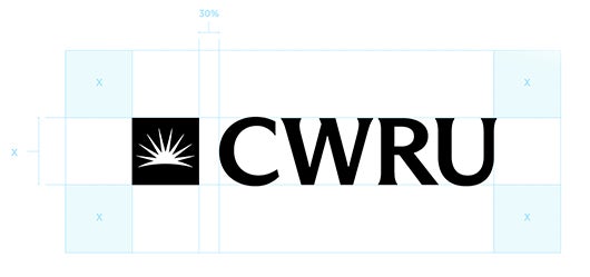
This acronym option is a less formal logo, and is limited to the following uses:
- As a secondary logo in print and web pieces (e.g., If the official logo appears on the cover of a multipage document, then the acronym may appear within the document; if on a web page, it may appear in the footer so long as a primary logo appears at or near the top);
- On merchandise and clothing (e.g., shirts, sweatshirts, hats), without the university’s full name; or
- On social media.
The clear space is determined by 50% of the height of the square, indicated by ‘x.’
The minimum reproduction size of the acronym logo is 1 inch wide in print and 100 x 18 px for digital use.
White Logos Options
When using the white version of the “Case Western Reserve” logos, the sunburst must always be white.
This logo has been set with customized letterforms and letter spacing and should not be recreated by retyping. Use the official vector artwork.
Two-Line Logo
Four-Line Logo
Stacked Four-Line Logo
Centered Four-Line Logo
Acronym Logo
Color Combinations
The CWRU Blue is the preferred colorway when legible. Do not change the color of official logo vectors.
Recommended Color Combinations
- CWRU Blue on White
- White on CWRU Blue
- CWRU Blue on Light Gray
- White on Force Blue
- Black on White
- White on Black
Color Combinations to Avoid
The following color combinations should be avoided. Make sure that the logos are always fully legible. The sunburst within the “Case Western Reserve” logo must always be white.
- CWRU True Blue on White
- CWRU Blue on True Blue
- CWRU True Blue on CWRU Blue
- CWRU Blue on Dark Gray
- CWRU Blue on Copper Red
- Any tertiary on another tertiary color
- CWRU Light Blue on White
- Black on CWRU True Blue
- CWRU Light Blue on Dark Blue
- Black on Dark Gray
- CWRU True Blue on Light Blue
- Outlined CWRU Blue on White


