See the world in CWRU colors.
Color is important when creating a brand identity. It is one of the most visible ways of evoking a precise brand association.
A focused color palette was chosen to help build brand awareness for Case Western Reserve University. “CWRU Blue” is the primary color of the university’s identity. Secondary blues and grays are supporting colors for use in formal communications.
Tertiary colors should only be introduced when additional color distinction is needed and should be used sparingly, never exceeding the percentage guidelines.
Logo Placement on Colors
When placing the logo on a solid background color, favor placements on the primary or secondary color palette. Determine which color is best for contrast and visual reproduction. Do not place the logo over a pattern.
If you place the logo over a photograph, position it in an uncluttered area to maximize visibility and impact.
Color Guide
Our color guide is designed to ensure consistent color across various print and digital media for all Case Western Reserve University projects. It should be sent to your vendor with every job. Please contact brand@case.edu with questions.
All color usage must pass accessibility standards and be clearly legible. View our accessibility standards for color usage.
Primary Color
CWRU Blue
PMS: 2146 C
PMS: 2146 U
CMYK: 100, 81, 0, 37
HEX: 003071
RGB: 0, 48, 113
Secondary Colors
CWRU Dark Blue
PMS: 2768 C
PMS: 2758 U
CMYK: 100 / 91 / 37 / 58
HEX: 09143A
RGB: 9, 20, 58
Force Blue
PMS: 2386 C
PMS: 2173 U
CMYK: 82 / 57 / 0 / 0
HEX: 2359ef
RGB: 35, 89, 239
CWRU True Blue
PMS: 2382 C
PMS: 2192 U
CMYK: 85 / 40 / 5 / 0
HEX: 007AB8
RGB: 0, 122, 184
CWRU Light Blue
PMS: 291 C
PMS: 290 U
CMYK: 35 / 0 / 5 / 0
HEX: A6D2E6
RGB: 166, 210, 230
Black
CMYK: 0, 0, 0, 100
HEX: 000000
RGB: 0, 0, 0
Dark Gray
PMS: Cool Gray 7 C
PMS: Cool Gray 8 U
CMYK: 0 / 0 / 0 / 50
HEX: 999999
RGB: 153, 153, 153
Light Gray
PMS: Cool Gray 2 C
PMS: Cool Gray 2 U
CMYK: 0 / 0 / 0 / 18
HEX: D3D3D3
RGB: 211, 211, 211
Tertiary Colors
Copper Red
PMS: 7625 C
PMS: 3556 U
CMYK: 11 / 90 / 100 / 2
HEX: D63D1F
RGB: 214, 61, 31
Orange
PMS: 3588 C
PMS: 1235 U
CMYK: 0 / 52 / 89 / 0
HEX: FF9239
RGB: 255, 146, 57
Blue Green
PMS: 2461 C
PMS: 7717 U
CMYK: 85 / 30 / 60 / 10
HEX: 377E72
RGB: 55, 126, 114
Violet Purple
PMS: 2587 C
PMS: 527 C
CMYK: 70 / 100 / 0 / 0
HEX: 692C95
RGB: 104, 44, 149
Vivid Green
PMS: 360 C
PMS: 2287 U
CMYK: 67 / 13 / 100 / 0
HEX: 61A530
RGB: 97, 165, 48
Tertiary Color Tones
Tones of colors can be used where appropriate to diversify the color palette. For a complete list of recommended tints, see the visual identity guidelines.
Color Proportions
A controlled use of the color palette is the key to creating a sense of visual consistency across the CWRU identity.
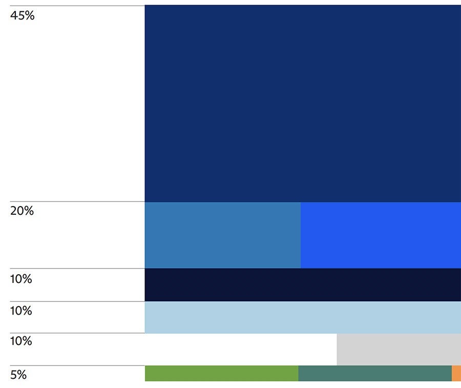
Use the CWRU Blue as the dominant color for the cover or first impressions on a piece of communication (at least 45%). The overall impression of the brand should be unambiguously CWRU Blue, with the other colors serving as accents, with usage not to exceed the following:
- 45%: CWRU Blue
- 20%: Combination of CWRU True Blue and Force Blue
- 10%: CWRU Light Blue
- 10%: CWRU Dark Blue
- 10%: Combination of white, light gray, dark gray and black
- 5%: Combination of tertiary colors
Download the brand guidelines to see specific usages.
General Usage Guidelines
Use the color palette in the approved ratios.
Do not use secondary or tertiary colors without the presence of CWRU Blue.
Do not use unapproved colors or alter the color palette.
Do not overpower the CWRU Blue with any other color.


