Understanding a key element to our brand.
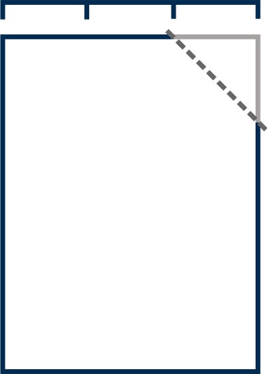
The open frame is a key component of our brand identity. It was created to tie together all the brand elements with a strong, unique graphic that represents the university’s brand. The open frame is meant to evoke a visual representation of the sunburst graphic in the university logo, with its open top-right corner, which signifies unlimited potential and “outside the box” thinking.
This graphic should appear on the cover of all printed marketing communications. The open frame can be used in a variety of weights and opacities, and can appear in any of the colors from the university’s palette. It should work within the grid of the layout of the piece. The open right corner should always be cut at a 45-degree angle and should be the size of one-third of the frame’s width. The variety of applications of the frame element allows for flexible, yet consistent designs.