MUNICIPAL SYMBOLS. Cleveland’s official municipal symbols include the city’s flag, motto, and ceremonial seal. Until 1895, Cleveland did not possess any of these symbols. Prominent New York journalist Julian Ralph first proposed the idea of a municipal flag. Ralph was visiting Cleveland to report on the city’s 1892 Federal Plan for Harper’s Weekly. Impressed by the city’s civic spirit, he was surprised that it lacked a flag of its own. In a conversation with star PLAIN DEALER reporter, William Stokely Lloyd, at the HOLLENDEN HOTEL on April 24, 1895, Ralph suggested that one be designed. “Let us make our citizens proud of the virtues of our cities,” Ralph stated. “Let us make them jealous of the political reputation of our cities. Let us cause them to be intent upon good government and upon maintaining it. One way to do this is to fly the city flag over their heads.”
Ralph’s suggestion was immediately met with an enthusiastic response from Cleveland’s civic and business leaders, especially on the eve of the city’s centennial. However, some patriotic Clevelanders, including Mayor ROBERT MCKISSON, feared that a municipal flag would compete in prominence with America’s national flag. Nevertheless, such concerns subsided for the moment, and the effort to select a municipal flag proceeded. As John Cavanaugh of the Cleveland Arts Club noted, “I do not see why we should not have [a flag]. Chicago and New York have theirs, and Cleveland should get in line.” Chicago artist E. A. Lloyd concurred, stressing that “Cleveland is thoroughly identified with PERRY’S VICTORY, as well as with MOSES CLEAVELAND and his trident. I think both of these subjects would afford a clever design for a civil emblem. We are already very proud of ours in Chicago, and Cleveland would certainly have every reason to be proud of hers.”
The contest to design a municipal flag with a “motto appropriate to Greater Cleveland” was held by The Plain Dealer, and time was of the essence, given the city’s fast-approaching centennial. The selection committee was to be chaired by none other than ARCHIBALD WILLARD, the famed Ohio artist behind the SPIRIT OF ’76. The offer was to be a prize of 50 silver dollars (approximately $1,700 in 2022) and resulted in the submission of over two dozen entries, including three design variations submitted by IHNA THAYER FRARY. The winner of the contest was 18-year-old Susan (“Susie”) Hepburn, an art school graduate, born in Ashtabula and a descendent of early Western Reserve settlers (Morris Hepburn, her grandfather, was listed in Cleveland's first municipal directory). Her design was first printed in The Plain Dealer on September 15. Praised for its power and simplicity, it was selected by the paper as the prize-winning design on the front page on October 19. Hepburn, then residing in Columbus, was soon dubbed the city’s own “Betsy Ross,” although, as The Plain Dealer pointed out in a later July 1941 story, she “never actually sewed together the first City of Cleveland flag.” Robert Beach, the reporter who traveled to Columbus and gave Ms. Hepburn the prize for her design (which he carelessly spilled in front of her), would later become her husband. They were wed the following year, in 1896. They had four children and remained married for 63 years, until Beach’s passing.
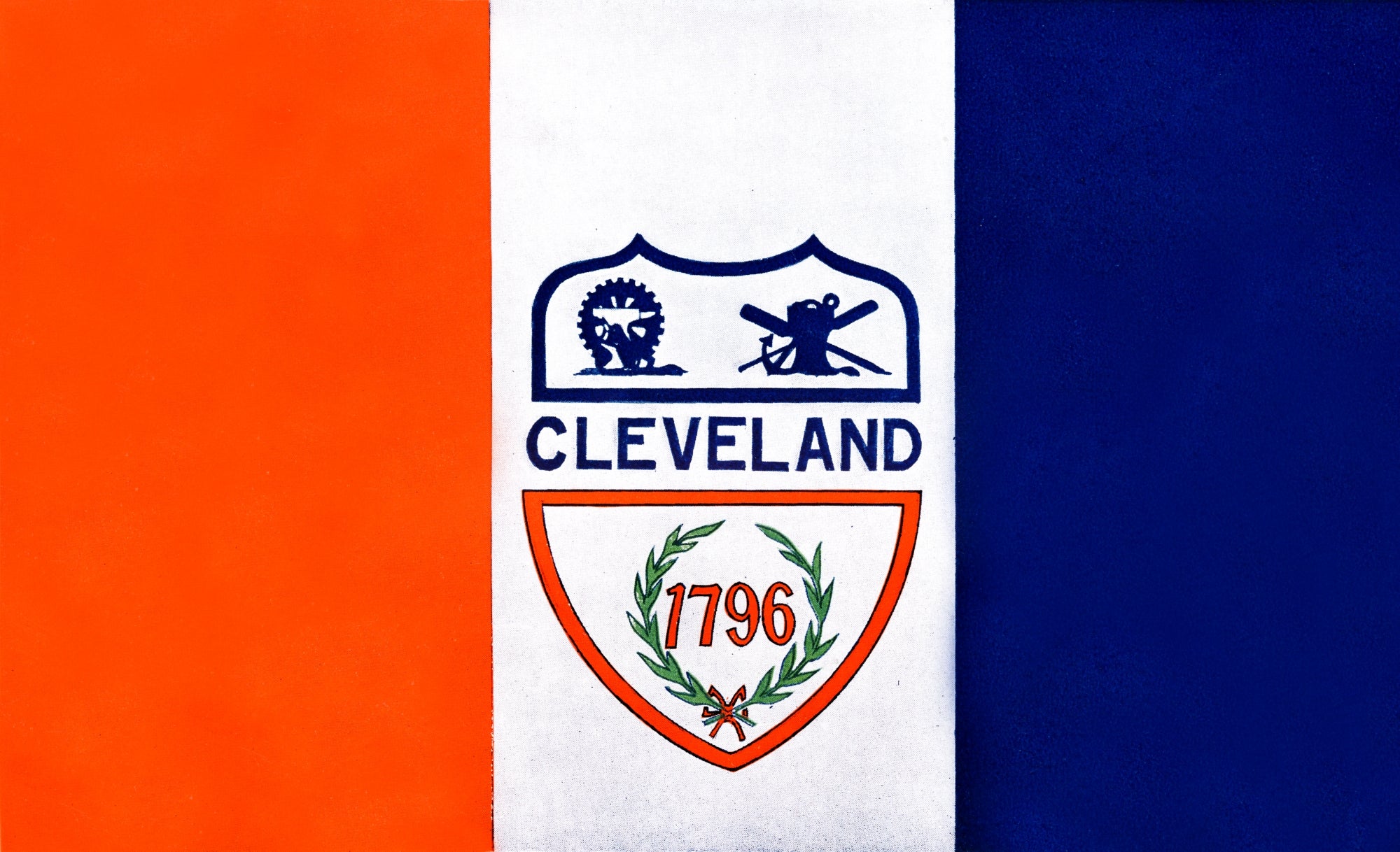
The Hepburn flag was unanimously adopted as the official municipal flag by Cleveland City Council on the evening of October 21, 1895. Popular enthusiasm over its adoption eventually reached southern Ohio, inspiring Cincinnati mayor John A. Caldwell to pursue the adoption of a flag for Cincinnati. However, when it came time to officially adopt the ordinance on the city flag, objections against it re-emerged, again over fears that it would eclipse the prominence of the American flag. The objections came largely from local veterans’ groups, with some even decrying it as “un-American.” Controversy persisted, and it would not be until February 24, 1896 that the ordinance on the Hepburn flag would be officially adopted. The official Charter of the City of Cleveland, implemented in 1913, describes the banner as follows:
“The Municipal emblem of the City shall be a banner of the following description and design: the banner shall consist of three (3) vertical stripes, of equal width, in color red, white and blue respectively, the red being nearest the standard and the white in the center. The middle stripe shall bear the American shield with the word ‘Cleveland,’ in blue, across its center, and the figures ‘1796’ in red, at its base, encircled by a laurel wreath. The outline of the lower half of the shield shall be in red and of the upper in blue. In the upper left-hand corner of the shield shall stand an anvil, hammer and wheel, and in the upper right-hand corner an anchor, windlass and oars. Under the shield, in black letters, shall be placed the words ‘Progress and Prosperity.’”
The red, white, and blue stripes represent patriotism, while the anvil, hammer, and wheel allude to industry, and the anchor, windlass (in some versions, capstan), and oars refer to Cleveland's position as a Great Lakes commercial port. The last portion – the text ‘Progress and Prosperity’ – was added later. In fact, the Hepburn design was one of the few proposals that lacked a municipal motto. This apparent oversight was to be remedied when the city’s flag committee met on October 25, 1895, to discuss the addition of a new motto. Wilson M. Day, President of the CLEVELAND CHAMBER OF COMMERCE, raised the proposal of the Latin “Major et Melior” (“Greater and Better”). However, Mayor McKisson insisted on having the motto in English and suggested “Unity and Progress” instead. The committee could not reach a consensus. Finally, three weeks later, on November 13, 1895, Mayor McKisson declared that “Progress and Prosperity” would be the city’s new municipal motto and that it would be added to the Hepburn flag. He made the announcement in Chattanooga, during his trip with the Chamber of Commerce to the Cotton States and International Exposition in Atlanta, where the Cleveland flag was to be debuted.
From the start, the inclusion of the “Progress and Prosperity” slogan on the flag proved to be contentious. According to a Plain Dealer article from November 26, 1895, a municipal ordinance on the banner’s adoption “provides for the motto ‘Progress and Prosperity’ on the flag.” However, the paper noted that “it is doubtful... whether any motto will be added, as the device is considered complete as it stands.” Indeed, for several decades after the flag’s official adoption, the municipal motto remained excluded from it. Moreover, although identified by city leaders in 1895 as the city’s “motto,” Cleveland’s city charter technically does not explicitly identify the text “Progress and Prosperity” as such legally. Nevertheless, the phrase is widely acknowledged as the city’s motto by Clevelanders today, even to the point that the Cleveland-based Market Garden Brewery produced twin beers with the names “Progress” and “Prosperity.”
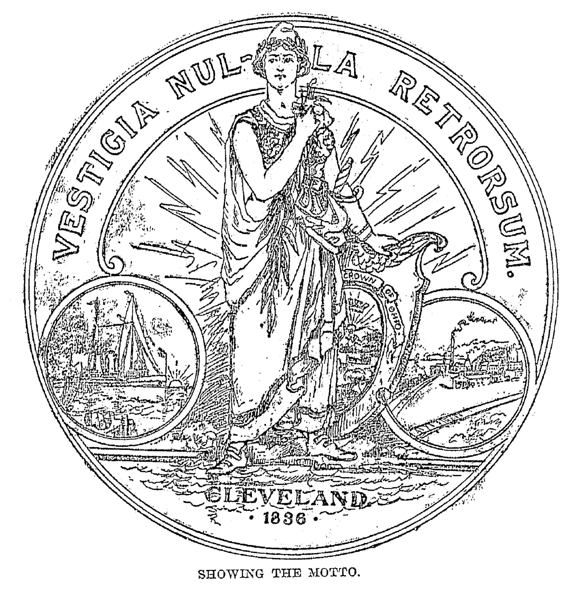
The competition to devise the municipal flag included proposals for a municipal seal. One such proposal came from R. V. Murray, a local artist, musician, and beekeeper who was born in Massachusetts to poor Scottish immigrant parents. Printed by The Plain Dealer on August 12, 1895, the Murray seal featured a grand Columbia-esque female personification of liberty wearing Hellenistic dress and a Phrygian cap with a laurel wreath, standing confidently on the shores of Lake Erie. Behind her stood a golden sun and a crown, alluding to “Cleveland as the crown of Ohio” in Murray’s words. Armed with a sword by her side, she had one hand resting on a shield featuring the Ohio state seal and the Latin motto “Vestigia Nulla Retrorsum” (“There Are No Steps Backward”), alluding to the notion of progress. To her left was an icon of a ship sailing, symbolizing Great Lakes commerce, and to her right, an icon of railroads and factories, symbolizing industry (which, in and of itself, was considered a symbol of “progress” by civic and business leaders of the day). Emblazoned on the bottom was the name “Cleveland” and year of the city’s incorporation, 1836 (surprisingly, not its original founding date of 1796). See his design here. A similar seal, complete with a “city goddess” was also proposed by another local artist, N. B. Dare. It was printed in The Plain Dealer on September 8.
Most major US cities (New York, Boston, Philadelphia, etc.) had seals similar to the one proposed by Murray, incorporating grand imagery and allusions to lofty notions of liberty and equality, with an accompanying Latin motto. Feminine representations of civic ideals were not uncommon and would later become embodied in some of Cleveland’s greatest architectural monuments, such as Daniel Chester French’s sculptures at the Metzenbaum U.S. Courthouse and the female representations of justice at the FEDERAL RESERVE BANK BUILDING and the CUYAHOGA COUNTY COURTHOUSE. One year before the Murray seal was presented to the public, architect LEVI SCOFIELD had unveiled his SOLDIERS’ AND SAILORS’ MONUMENT on PUBLIC SQUARE, with a similar Lady Liberty figure standing at its top. She was reportedly modeled after none other than Schofield’s beloved wife, Elizabeth.
However, while Clevelanders may have had the desire to adopt a seal such as Murray’s, they found that they were unable to do so, due to the fact that an Ohio state statute specified that municipal seals had to be identical to the Ohio state seal. Therefore, for several decades, Cleveland had no official seal of its own aside from that of the state. It was not until the MAYORAL ADMINISTRATION OF RALPH J. PERK that Cleveland was able to adopt a distinctive seal of its own. The effort to change the seal began in January 1973, two years after the city adopted the red and white carnation as the official municipal flower in May 1971. The push was led by Councilman John J. Prince who, in the words of one Plain Dealer reader, did not see “much sense in the Cleveland city seal bearing a sketch of a couple of hills 36 miles south of Columbus.” Indeed, the idyllic rural scene of the rolling hills of the Ohio countryside seemed to contrast entirely with the reality of Cleveland’s image as a large industrial metropolis.
In response, much like the selection of the municipal flag 80 years earlier, The Plain Dealer announced a contest for a new city seal design - albeit with no cash award - on January 11, 1973. The contest was “strictly unofficial,” with Mayor Perk appointing the Cleveland Area Arts Council to conduct the official competition for a prize of $1,000. In the official contest, a panel of judges would select three to six of the best designs, leaving the final decision to the mayor and Cleveland City Council. Predictably, many applicants submitted designs to both contests, with over 80 applicants from Cleveland and various parts of Cuyahoga County submitting designs to the Plain Dealer competition. Several entries in the latter were published in a special feature of the newspaper’s Sunday magazine on April 1, 1973. Dubbed “the Great Seal Hunt,” the feature was accompanied by a mock city seal with an illustration of a large barking seal lounging around the city’s DOWNTOWN. One of the published entries echoed John Francis Morell’s mural Life is Sharing the Same Park Bench, symbolizing urban racial harmony in the shadow of Cleveland’s TERMINAL TOWER. Not to be outdone, the artists of the CLEVELAND PRESS advanced several proposals of their own, ranging from the sublime to the satirical. One depicted the city skyline with a flaming CUYAHOGA, an accordion, and a bowling ball with a kielbasa in the foreground. Yet another created a seal centered around the vandalized version of Rodin’s The Thinker from the CLEVELAND MUSEUM OF ART.
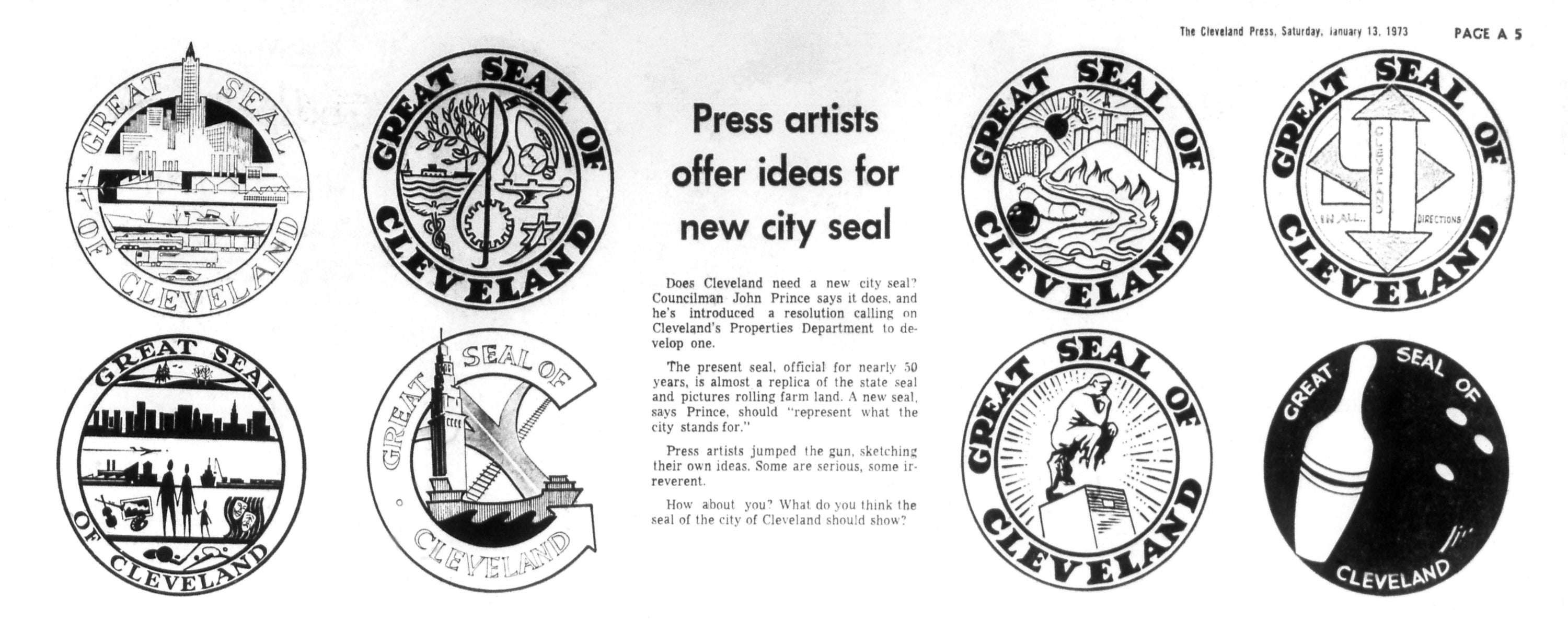
By July 26, the entries had been narrowed down to three finalists, one designed by Alan R. Work and two designed by the team of John R. Nottingham and John W. Spirk, Jr. The judges asked these artists to make additional enhancements to their entries. Of these, one of the Nottingham-Spirk submissions was selected as the finalist and praised for its “urbanity” by the selection committee. On November 19, 1973, the city adopted a new seal and even at this time, it had to be identified as a “ceremonial seal,” while the Ohio state seal retained the status of “corporate seal.” The attributes of the 1973 seal were as follows:
“The ceremonial seal of the City of Cleveland shall consist of a circular design divided into four (4) quadrants. The upper left quadrant shall contain a stylized skyline of the City. The upper right quadrant shall contain a leaf and tree symbol. The lower left quadrant shall contain a symbol of meshing gears. The lower right quadrant shall contain a stylized water symbol. The circumscription surrounding the new seal shall read ‘The Great Seal of the City of Cleveland.’ The ceremonial seal is established and shall be used for ceremonial purposes only.”
Before the selection became official, Councilman Prince enthusiastically asserted that the seal would be promoted throughout the city and affixed on everything from city offices to city cars. However, the seal never came into common use, a fact bemoaned by Dick Feagler of the Cleveland Press in an article from October 17, 1975, entitled “The city symbol’s fate is sealed.” In his article, Feagler highlighted that some at City Hall were not even aware that a new emblem had been adopted at all! The Nottingham-Spirk seal would be eventually replaced by the current “American flag” seal adopted during the MAYORAL ADMINISTRATION OF MICHAEL R. WHITE. This seal features five stars representing each time Cleveland received the All-America City distinction from the National Civic League. Since then, there have been some calls from Clevelanders to revise the city’s municipal symbols, particularly the seal. Although the municipal flag remains largely unchallenged by most Clevelanders, critics contend that the seal lacks any meaningful reference to Cleveland’s history, geography, culture, or identity.
Meanwhile, a variation of the 1973 Nottingham-Spirk design has taken on a new life as the official seal for Cuyahoga County. Modified by local graphic designer Nolan Beck, the seal was adopted by the county in June 2014 to represent a “new beginning” following the 2008-10 county corruption scandal. However, although promoted as a “new” design by the county, the seal looks almost indistinguishable from Nottingham-Spirk city seal of 1973.
In addition to these official municipal symbols, the city also has several unofficial symbols, the most prominent of which is the iconic Terminal Tower, completed in 1927. Although later surpassed in height by Cleveland’s KEY TOWER in 1990, its status as a source of civic pride and historical achievement remains unparalleled. The image of the tower can be found throughout the city on everything from taxi cabs to beer labels to the rotunda of CLEVELAND CITY HALL. Civic reverence for the structure was such that, for several decades until the completion of Key Tower, no building was to rival the Terminal Tower in height.
A much more recent icon of Cleveland has been the Cleveland Script Sign. There are five versions of this sign located throughout the city, in EDGEWATER PARK, NORTH COAST HARBOR, TREMONT, CUYAHAOGA VALLEY, and NORTH SHORE COLLINWOOD. The one at Edgewater Park has become an especially popular tourist destination, both for visitors and locals. The signs were originally devised by the city’s local tourist agency, Destination Cleveland, but soon took on a life of their own, becoming a recognizable icon for the city in the early decades of the 21st century.
All of these symbols are united by their attachment to the unique Cleveland context. They attest to a strong sense of civic pride for a city that, much like the Cuyahoga River, has seen its fair share of winding twists and turns throughout its history.
Pietro A. Shakarian
American University of Armenia, Yerevan
Last updated: 10/3/2022
Plain Dealer archives.